




Introduction
Circle Graphs is an important Grade 7 math skill because students are moving from simple answers toward explaining how the math works.
In this lesson, students use models, real questions, worked examples, practice problems, and two online quizzes to build confidence with circle graphs.
What Is Circle Graphs?
Circle Graphs means reading, creating, and explaining displays so data can answer real questions.
The goal is not only to get the answer. Students should be able to show the idea, explain the strategy, and check whether the answer makes sense.
Understanding Circle Graphs
Before solving, students should slow down and decide what each number, shape, unit, or label represents.
- Read the title, labels, and scale before answering.
- Use the scale value instead of counting marks as ones when the graph is scaled.
- Compare categories by subtracting or adding values from the display.
- Explain what the data shows in a complete sentence.
Visual Models
Visual Model 1
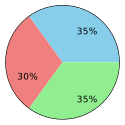
Question: The circle graph above shows favorite types of cuisine at a restaurant. Blue represents Asian, red represents Italian, and green represents Mexican. If \(400\) customers were surveyed, how many prefer Italian?
- A. \(120\)
- B. \(140\)
- C. \(160\)
- D. \(280\)
Why it works: Red (Italian) is \(30\%\) of \(400 = 0.30 \times 400 = 120\) customers.
Answer: \(120\)
Visual Model 2
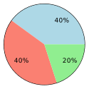
Question: The circle graph shows the results of a survey on transportation methods. Blue is cars (\(40\%\)), salmon is buses (\(40\%\)), and green is bicycles (\(20\%\)). If \(500\) people were surveyed, how many use bicycles?
- A. \(50\)
- B. \(100\)
- C. \(200\)
- D. \(400\)
Why it works: \(20\%\) of \(500 = 0.20 \times 500 = 100\) people.
Answer: \(100\)
Worked Examples
Example 1
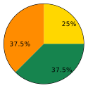
Question: The circle graph shows student class enrollment distribution. Gold is Algebra (\(25\%\)), orange is Geometry (\(37.5\%\)), and coral is Statistics (\(37.5\%\)). If \(800\) students are surveyed, how many are in Geometry?
- A. \(200\)
- B. \(250\)
- C. \(300\)
- D. \(400\)
- \(37.5\%\) of \(800 = 0.375 \times 800 = 300\) students.
Answer: \(300\)
Example 2
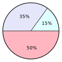
Question: The circle graph shows water usage distribution. Cyan represents outdoor watering (\(15\%\)), lavender is indoor usage (\(35\%\)), and pink is other uses (\(50\%\)). If the household uses \(300\) gallons per day, how many gallons are used for outdoor watering?
- A. \(15\) gallons
- B. \(45\) gallons
- C. \(105\) gallons
- D. \(150\) gallons
- \(15\%\) of \(300 = 0.15 \times 300 = 45\) gallons.
Answer: \(45\) gallons
Example 3
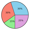
Question: The circle graph shows movie genre preferences. Blue is action (\(30\%\)), salmon is drama (\(30\%\)), green is comedy (\(15\%\)), and purple is thriller (\(25\%\)). If \(1200\) people were surveyed, how many prefer drama?
- A. \(180\)
- B. \(300\)
- C. \(360\)
- D. \(600\)
- \(30\%\) of \(1200 = 0.30 \times 1200 = 360\) people.
Answer: \(360\)
Real-World Word Problems
Problem 1
Question: A circle graph shows students' favorite subjects. If \(35\%\) prefer Math and the school has \(260\) students, how many students prefer Math?
- A. \(35\)
- B. \(65\)
- C. \(91\)
- D. \(169\)
Why it works: \(35\%\) of \(260=0.35\times260=91\) students.
Answer: \(91\)
Problem 2
Question: In a circle graph of sports preferences, \(20\%\) of the \(180\) surveyed students prefer soccer. How many students prefer soccer?
- A. \(20\)
- B. \(36\)
- C. \(72\)
- D. \(144\)
Why it works: \(20\%\) of \(180 = 0.20 \times 180 = 36\) students.
Answer: \(36\)
Common Mistakes
- Ignoring the graph scale.
- Reading the wrong category or axis label.
- Answering a comparison question without subtracting.
- Writing a number without explaining what it represents.
Strategy Tips
- Circle the scale before using the graph.
- Write down the value for each category you compare.
- Use addition for totals and subtraction for differences.
- Answer in words so the data result has meaning.
Practice Questions
Question 1
A circle graph displays energy usage in a household. Heating accounts for \(45\%\) of the energy. If the total monthly energy is \(500\) kWh, how much energy is used for heating?
- A. \(45\) kWh
- B. \(125\) kWh
- C. \(225\) kWh
- D. \(455\) kWh
Question 2
A percent can be converted to an angle in a circle graph. What angle corresponds to \(25\%\) of a circle?
- A. 45°
- B. 60°
- C. 90°
- D. 120°
Question 3
A circle graph shows how a family spends its monthly budget. Rent is \(30\%\), food is \(25\%\), utilities is \(15\%\), and savings is \(30\%\). Which categories tie for the largest sector?
- A. Food and Utilities
- B. Utilities and Savings
- C. Rent and Savings
- D. Food and Rent
Question 4
A survey asked \(150\) people about their favorite ice cream flavor. The circle graph shows vanilla is \(40\%\), chocolate is \(35\%\), and strawberry is \(25\%\). How many people prefer chocolate?
- A. \(35\)
- B. \(40\)
- C. \(52.5\)
- D. \(60\)
Question 5
A circle graph shows the distribution of pets owned by households in a neighborhood. Dogs account for \(40\%\) of the \(80\) households surveyed. How many households own dogs?
- A. \(20\)
- B. \(32\)
- C. \(48\)
- D. \(64\)
Question 6
A circle graph displays the distribution of rainy days per season in a region. Summer has \(5\%\), fall has \(25\%\), winter has \(45\%\), and spring has \(25\%\). If the year has \(365\) days, approximately how many rainy days occur in winter?
- A. \(45\)
- B. \(91\)
- C. \(164\)
- D. \(183\)
Full Answer Explanations Click to show all answers and explanations
Question 1
Answer: \(225\) kWh
\(45\%\) of \(500 = 0.45 \times 500 = 225\) kWh.
Question 2
Answer: 90°
\(25\%\) of \(360° = 0.25 \times 360° = 90°\).
Question 3
Answer: Rent and Savings
Rent and Savings are both \(30\%\), the largest percentage. Food is \(25\%\) and utilities is \(15\%\).
Question 4
Answer: \(52.5\)
\(35\%\) of \(150 = 0.35 \times 150 = 52.5\) people.
Question 5
Answer: \(32\)
\(40\%\) of \(80 = 0.40 \times 80 = 32\) households.
Question 6
Answer: \(164\)
\(45\%\) of \(365 \approx 0.45 \times 365 = 164.25 \approx 164\) days.
Connection to Standards
This lesson supports Grade 7 math expectations for reasoning, modeling, problem solving, and explaining answers clearly. It connects classroom skills to the kind of questions students see on state math assessments.
Summary
Circle Graphs becomes easier when students connect the question to a model, use clear steps, and explain why the answer fits.
GOLDEN RULE
Read the scale before reading the answer.