
CH05-02 lesson

Describing Data: Center, Spread, and Shape Learning Activity

A focused Grade 6 learning session for Describing Data: Center, Spread, and Shape using visual models, worked examples, strategy guidance, and a short mastery check.

15
minutes
6
lesson parts
11
practice items
Learning goal

Students will build Grade 6 mastery of describing data: center, spread, and shape using models, equations, and test-style reasoning.

Student goal: I can solve problems involving describing data: center, spread, and shape.

Helpful first: Statistical Questions
concept

Learn the Idea

Describing Data: Center, Spread, and Shape means reading, creating, and explaining displays so data can answer real questions.

  • Read the title, labels, and scale before answering.
  • Use the scale value instead of counting marks as ones when the graph is scaled.
  • Compare categories by subtracting or adding values from the display.
  • Explain what the data shows in a complete sentence.
visual model

See the Math

Visual Model 1

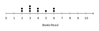
Question: The dot plot below shows the number of books read by students in one month. What is the median number of books read?

Visual Model 1

  • A. 3
  • B. 4
  • C. 5
  • D. 6

Why it works: Data: \(2, 2, 3, 3, 3, 4, 4, 5, 6, 6\) (10 values). Median is average of 5th and 6th values: \((3 + 3) / 2 = 3\).

Answer: 3

worked example

Follow a Worked Example

Example 1

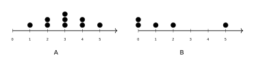
Question: Which dot plot shows data with a symmetric distribution?

Example 1

  • A. Plot A (symmetric)
  • B. Plot B (skewed)
  • C. Both are symmetric
  • D. Neither is symmetric
  1. Plot A forms a triangle shape with a peak in the middle (at 3), with equal tails on both sides.
  2. Plot B has outliers on the right, making it skewed right.

Answer: Plot A (symmetric)

Example 2

Question: Two classes compared their quiz scores using dot plots. Class X has dots clustered at 8--9. Class Y has dots spread from 3--10. What can you infer?

Example 2

  • A. Class X has a smaller range (more consistent)
  • B. Class Y has a smaller range (more consistent)
  • C. Both classes have the same range
  • D. You cannot compare ranges from dot plots
  1. Class X range = 9 -- 8 = 1.
  2. Class Y range = 10 -- 3 = 7.
  3. A smaller range indicates more consistent scores.
  4. Class X is much more tightly clustered.

Answer: Class X has a smaller range (more consistent)

real world

Connect It to a Real Situation

Problem 1

Question: Using the same dot plot from the previous question, what is the mean number of books read (rounded to the nearest whole number)?

  • A. 3
  • B. 4
  • C. 5
  • D. 6

Why it works: Sum = \(2 + 2 + 3 + 3 + 3 + 4 + 4 + 5 + 6 + 6 = 38\). Mean = \(38 \div 10 = 3.8\), which rounds to 4.

Answer: 4

strategy

Avoid Mistakes and Choose a Strategy

  • Ignoring the graph scale.
  • Reading the wrong category or axis label.
  • Answering a comparison question without subtracting.
  • Writing a number without explaining what it represents.
  • Circle the scale before using the graph.
  • Write down the value for each category you compare.
  • Use addition for totals and subtraction for differences.
  • Answer in words so the data result has meaning.
summary

Remember the Key Idea

Describing Data: Center, Spread, and Shape becomes easier when students connect the question to a model, use clear steps, and explain why the answer fits.

GOLDEN RULE

Read the scale before reading the answer.

Guided to independent practice

Solve before opening the answer

Use scratch paper. The explanation matters more than simply seeing whether the choice is correct.

warmup

2 questions
G6-C05-T02-Q001 About 1 min

Which of the following describes the CENTER of a data set?

  1. A Range
  2. B Median
  3. C Interquartile range
  4. D Maximum value
Check answer and explanation

Answer B: Median

Measures of center include the mean and median. Range, interquartile range, and maximum describe the spread or extremes of the data.

G6-C05-T02-Q002 About 1 min

What is the mean of the data set: \(3, 5, 7, 9, 11\)?

  1. A 5
  2. B 11
  3. C 9
  4. D 7
Check answer and explanation

Answer D: 7

Sum = \(3 + 5 + 7 + 9 + 11 = 35\). Mean = \(35 \div 5 = 7\).

guided

1 question
G6-C05-T02-Q003 About 1 min

Find the median of: \(2, 8, 4, 6, 10, 5, 3\).

  1. A 4
  2. B 5
  3. C 6
  4. D 7
Check answer and explanation

Answer B: 5

Order the data: \(2, 3, 4, 5, 6, 8, 10\). The middle value is the 4th value, which is 5.

practice

5 questions
G6-C05-T02-Q004 About 1 min

Which measure describes the SPREAD of a data set?

  1. A Mean
  2. B Median
  3. C Range
  4. D Mode
Check answer and explanation

Answer C: Range

Spread measures include range, interquartile range (IQR), and mean absolute deviation (MAD). Mean and median are measures of center; mode is the most frequent value.

G6-C05-T02-Q005 About 1 min

What is the range of the data set: \(12, 28, 5, 45, 19\)?

  1. A 5
  2. B 12
  3. C 40
  4. D 45
Check answer and explanation

Answer C: 40

Range = Maximum \(-\) Minimum = \(45 - 5 = 40\).

G6-C05-T02-Q006 About 1 min

What is the mode of: \(1, 2, 2, 3, 3, 3, 4\)?

  1. A 3
  2. B 2
  3. C 1
  4. D 4
Check answer and explanation

Answer A: 3

The mode is the value that appears most often. The value 3 appears three times.

G6-C05-T02-Q007 About 1 min

The dot plot below shows the number of books read by students in one month. What is the median number of books read?

Describing Data: Center, Spread, and Shape visual for G6-C05-T02-Q007
  1. A 3
  2. B 4
  3. C 5
  4. D 6
Check answer and explanation

Answer A: 3

Data: \(2, 2, 3, 3, 3, 4, 4, 5, 6, 6\) (10 values). Median is average of 5th and 6th values: \((3 + 3) / 2 = 3\).

G6-C05-T02-Q008 About 1 min

Using the same dot plot from the previous question, what is the mean number of books read (rounded to the nearest whole number)?

  1. A 3
  2. B 4
  3. C 5
  4. D 6
Check answer and explanation

Answer B: 4

Sum = \(2 + 2 + 3 + 3 + 3 + 4 + 4 + 5 + 6 + 6 = 38\). Mean = \(38 \div 10 = 3.8\), which rounds to 4.

exit

3 questions
G6-C05-T02-Q009 About 1 min

A data set has a mean of 15 and a median of 12. What does this tell us about the shape of the data?

  1. A The data is symmetric
  2. B The data is bimodal
  3. C The data is skewed left
  4. D The data is skewed right
Check answer and explanation

Answer D: The data is skewed right

When mean > median, the data is skewed right. The mean is pulled toward the larger outliers on the right.

G6-C05-T02-Q010 About 1 min

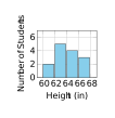
The histogram shows the heights (in inches) of students in a class. Which interval contains the most students?

Describing Data: Center, Spread, and Shape visual for G6-C05-T02-Q010
  1. A 60--62 inches
  2. B 62--64 inches
  3. C 64--66 inches
  4. D 66--68 inches
Check answer and explanation

Answer B: 62--64 inches

The tallest bar in the histogram represents the 62--64 inch interval with 5 students.

G6-C05-T02-Q011 About 1 min

Which dot plot shows data with a symmetric distribution?

Describing Data: Center, Spread, and Shape visual for G6-C05-T02-Q011
  1. A Plot A (symmetric)
  2. B Plot B (skewed)
  3. C Both are symmetric
  4. D Neither is symmetric
Check answer and explanation

Answer A: Plot A (symmetric)

Plot A forms a triangle shape with a peak in the middle (at 3), with equal tails on both sides. Plot B has outliers on the right, making it skewed right.

Page UP