




Introduction
Comparing Two Populations Visually is an important Grade 7 math skill because students are moving from simple answers toward explaining how the math works.
In this lesson, students use models, real questions, worked examples, practice problems, and two online quizzes to build confidence with comparing two populations visually.
What Is Comparing Two Populations Visually?
Comparing Two Populations Visually means choosing a model, naming what each number means, and explaining the strategy.
The goal is not only to get the answer. Students should be able to show the idea, explain the strategy, and check whether the answer makes sense.
Understanding Comparing Two Populations Visually
Before solving, students should slow down and decide what each number, shape, unit, or label represents.
- Read the question carefully and identify what is being asked.
- Choose a model, equation, table, or diagram that matches the situation.
- Solve one step at a time and keep units or labels attached.
- Use the answer explanation to check that the result makes sense.
Visual Models
Visual Model 1
Question: The dot plots below show the number of text messages sent by two groups of students during a school day. Which group has a higher center (median)?

- A. Group 1
- B. Group 2
- C. Both groups have the same median
- D. Cannot be determined from the plot
Why it works: Group 2's dots are positioned further to the right (at 3, 3.5, 4, 5, 5.5, 6, 6.5) compared to Group 1 (at 1, 1.5, 2, 2.5, 3.5), so the median of Group 2 is higher.
Answer: Group 2
Visual Model 2
Question: Looking at the dot plots of items purchased, which statement best describes the overlap?
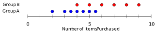
- A. Group A typically buys fewer items; Groups overlap at 4--5
- B. Group B always buys more items than Group A
- C. No overlap exists between the groups
- D. Both groups buy identical amounts
Why it works: Group A centers at 3--5 (peak at 4). Group B centers at 5--9 (peak at 7). Overlap occurs at 4--5. Group A's lower center is clear despite overlap.
Answer: Group A typically buys fewer items; Groups overlap at 4--5
Worked Examples
Example 1
Question: The box plots show practice hours for two soccer teams. Based on the visual, what is true about their centers and spreads?

- A. Team A: median \(\approx 4.5\); Team B: median \(\approx 6.5\); Team B more spread
- B. Team A practices more than Team B
- C. Both teams practice identically
- D. Medians cannot be compared from box plots
- From the visual: Team A's box (2--6) has median at 4.5.
- Team B's box (4--9) has median at 6.5.
- Team B's box spans 5 units (4--9) vs.
- Team A's 4 units (2--6), so Team B has more spread.
Answer: Team A: median \(\approx 4.5\); Team B: median \(\approx 6.5\); Team B more spread
Example 2
Question: Two box plots show the test scores of Class A (median \(=82\), range \(=30\)) and Class B (median \(=78\), range \(=14\)). The box plot for Class A spans from 67 to 97; Class B spans from 71 to 85. Which statement is best supported by the visuals?
- A. Class A and Class B score ranges overlap from 71 to 85
- B. Class A's scores varied more and its typical score was higher
- C. Class B is always worse regardless of median
- D. Class A has higher minimum but Class B more consistent
- Class A's range of 30 (67–97) is larger than Class B's range of 14 (71–85), showing greater variability.
- Class A's median (82) is higher than Class B's (78).
- Despite overlap at 71–85, Class A is higher and more variable overall.
Answer: Class A's scores varied more and its typical score was higher
Example 3
Question: A histogram shows heights (in inches) of students in two grades. Grade 6's histogram peaks at 60–62 inches (range 55–68 inches). Grade 7's histogram peaks at 63–65 inches (range 58–70 inches). Based on this comparison, which statement is TRUE?
- A. Grade 7's typical height is greater, and distributions overlap from 58–68 inches
- B. Every Grade 7 student is taller than Grade 6
- C. Grade 6 is always shorter
- D. Grade 6 has more height variation
- Grade 7 peaks at 63–65 (higher typical height) vs.
- Grade 6 at 60–62.
- The ranges (Grade 6: 55–68, Grade 7: 58–70) overlap significantly from 58–68 inches, so some Grade 6 students are taller than some Grade 7 students.
Answer: Grade 7's typical height is greater, and distributions overlap from 58–68 inches
Real-World Word Problems
Problem 1
Question: Two histograms show daily temperature (in degrees Fahrenheit) over a month for City A and City B. City A's temperatures cluster at 70–75 degrees (range 5 degrees). City B's temperatures span 50–90 degrees (range 40 degrees). Where do the distributions overlap?
- A. City A has more variable temperatures
- B. City B is always hotter than City A
- C. Distributions overlap at 70–75 degrees; City A is more consistent
- D. City B never reaches City A's temperature
Why it works: City A clusters at 70–75 (range 5), indicating consistency. City B spans 50–90 (range 40), showing high variability. Both distributions include temperatures 70–75 degrees, so they overlap there.
Answer: Distributions overlap at 70–75 degrees; City A is more consistent
Problem 2
Question: Two histograms compare the quiz scores of morning and afternoon classes. The morning class shows bars centered around 85\textendash 90, while the afternoon class shows bars centered around 75\textendash 80. What does this suggest?
- A. Morning students scored higher on average
- B. Afternoon students are smarter
- C. Both classes performed equally well
- D. Quiz difficulty was higher for morning students
Why it works: The histogram center (where bars cluster) indicates the typical score range. Morning (85--90) is higher than afternoon (75--80), so morning students performed better on average.
Answer: Morning students scored higher on average
Common Mistakes
- Rushing before identifying what the numbers represent.
- Choosing an operation that does not match the situation.
- Dropping labels, units, or context from the answer.
- Skipping the estimate or reasonableness check.
Strategy Tips
- Underline the question being asked.
- Use a model before jumping to computation.
- Write an equation that matches the story or picture.
- Explain the final answer in a sentence.
Practice Questions
Question 1
A stem-and-leaf plot shows the ages of workers at two companies. Company X has data: 22, 24, 25, 26, 29; Company Y has data: 18, 19, 22, 45, 48. Which statement is best supported?
- A. Company X has a higher median and less spread
- B. Company Y has younger workers overall
- C. Both companies have the same age distribution
- D. Company X workers are older than Company Y workers
Question 2
A dot plot shows customer wait times (in minutes) at two restaurants. Restaurant X: 3, 4, 4, 5, 5, 5, 6, 6, 7 (minutes); Restaurant Y: 2, 5, 8, 10, 12, 15 (minutes). Which restaurant has more predictable wait times?
- A. Restaurant X (clustered around 5 minutes)
- B. Restaurant Y (varies from 2 to 15 minutes)
- C. Both restaurants have equally predictable times
- D. Restaurant Y is always faster
Question 3
Two box plots compare monthly rainfall (in inches) for Region A and Region B. Region A: IQR (Interquartile Range) = 3 inches; Region B: IQR = 8 inches. What does this comparison reveal?
- A. Region A has more variable rainfall
- B. Region B has a wider middle 50% of data (more variability in the middle)
- C. Both regions have identical rainfall patterns
- D. Region A receives more total rain annually
Question 4
A histogram shows the ages of visitors at Museum A and Museum B. Museum A has visitors aged 20\textendash 30 dominating the histogram. Museum B has visitors more evenly distributed across ages 10\textendash 70. Which interpretation is valid?
- A. Museum A appeals mainly to younger adults; Museum B attracts a broader age range
- B. Museum B is more popular than Museum A
- C. Museum A has older visitors overall
- D. Both museums serve the same demographics
Question 5
Two dot plots show the number of text messages sent during a study session by two groups. Group P: 5, 6, 6, 7, 7, 7, 8, 8, 9 (messages); Group Q: 1, 2, 9, 10, 11, 12 (messages). Which group was more focused (less distracted)?
- A. Group P (consistent messaging around 7)
- B. Group Q (sent very few messages)
- C. Both groups sent identical messages
- D. Group Q was more focused
Question 6
A box plot compares video game scores (in points) for two players. Player A: Median = 1500, Q1 = 1200, Q3 = 1800. Player B: Median = 1400, Q1 = 1100, Q3 = 2000. Which player has more consistent performance?
- A. Player A (smaller IQR: 600 vs. 900)
- B. Player B (higher third quartile)
- C. Both players have identical consistency
- D. Player B (higher maximum score)
Full Answer Explanations Click to show all answers and explanations
Question 1
Answer: Company X has a higher median and less spread
Company X's median is 25, and Company Y's median is 22. Company X's range is 7 (29--22), while Company Y's range is 30 (48--18), showing less spread in Company X.
Question 2
Answer: Restaurant X (clustered around 5 minutes)
Restaurant X has most data points near 5 minutes with range 4 (from 3 to 7). Restaurant Y's range is 13 (from 2 to 15) with data spread across the range, making it less predictable.
Question 3
Answer: Region B has a wider middle 50% of data (more variability in the middle)
The IQR (from Q1 to Q3) represents the spread of the middle 50% of data. A larger IQR (8 vs. 3) indicates more variability in the central portion of the distribution.
Question 4
Answer: Museum A appeals mainly to younger adults; Museum B attracts a broader age range
The histogram shows where the majority of data concentrates. Museum A's concentration at 20--30 indicates younger adult appeal. Museum B's even distribution shows visitors of all ages.
Question 5
Answer: Group P (consistent messaging around 7)
While both groups sent messages, Group P's clustering at 7 messages shows a consistent pattern during study. Group Q's extreme values (1--2, then 9--12) suggest interruptions, making Group P appear more consistently focused.
Question 6
Answer: Player A (smaller IQR: 600 vs. 900)
Player A's IQR = 1800 -- 1200 = 600; Player B's IQR = 2000 -- 1100 = 900. A smaller IQR indicates less variability in the middle 50% of scores, so Player A is more consistent.
Connection to Standards
This lesson supports Grade 7 math expectations for reasoning, modeling, problem solving, and explaining answers clearly. It connects classroom skills to the kind of questions students see on state math assessments.
Summary
Comparing Two Populations Visually becomes easier when students connect the question to a model, use clear steps, and explain why the answer fits.
GOLDEN RULE
Understand the model before choosing the operation.