How to Make Pie graphs or Circle graph
Read,3 minutes
A pie chart is a graphic representation of info in the form of a round chart or pie where pie slices show the size of the data. A listing of mathematical variables along with categorical variables is needed in order to show data in a pie graph format. The arc length of each slice and so its area, along with the central angle it forms in the pie chart, is in proportion to the amount it represents.
Pie Chart Formula
A pie chart’s total value is always one hundred percent. In addition, a circle subtends a \(360°\) angle. So, the total value of all the info equals \(360°\). Based on that, two primary formulas are used:
- To calculate the percentage of the given info, use the following formula: \((Frequency \ \div \ Total Frequency) \ \times \ 100\)
- To change the info to degrees use this formula: \((Provided \ data \ \div \ Total \ value \ of \ Information) \ \times \ 360°\)
It’s possible to figure out a specific pie chart’s percentage by using the steps here:
- Step 1: Classify the given data and figure out the total
- Step 2: Divide up all the various categories
- Step 3: Change the data to percentages
- Step 4: Calculate the degrees
Ways to use Pie Charts
Whenever information has to get shown visually using a fractional part of a whole, we use pie charts. It is used to compare information and discover why one part is smaller/bigger than another. So, when you are given a limited amount of buckets along with distinct data sets, it’s a smarter idea to use pie charts. Here are a few uses for pie charts:
- In a business, it is used to compare growth areas such as profits and losses.
- In schools, pie charts are used to show the time allocated to each section, thus showing pupils’ grades as percentages, etc.
- Pie charts are used to compare the relative quantity of in regarding people having the same vehicles, similar houses, etc.
- They are used to show marketing and sales info to compare more than one brand.
Making a Pie Chart
Here are the steps used to make a pie chart. Via using the aforementioned formulas, the information can be figured out.
- Step 1: Place all the data in a table, after that, add it all of to discover the total.
- Step 2: To find the values in the form of a percentage, one has to divide each of them via the total, after that multiply it by one hundred.
- Step 3: To find the amount of degrees for each of the pie pieces you need, take a complete circle of \(360°\) and use the following formula: \(\frac{Frequency}{Total \ Frequency} \ \times \ 360°\)
- Step 4: Whenever all the degrees to make the pie chart are figured out, draw a circle (pie chart) using the computed measurements with the help of a protractor.
Free printable Worksheets
Exercises for The Pie Graph or Circle Graph
1) Which color is the most?
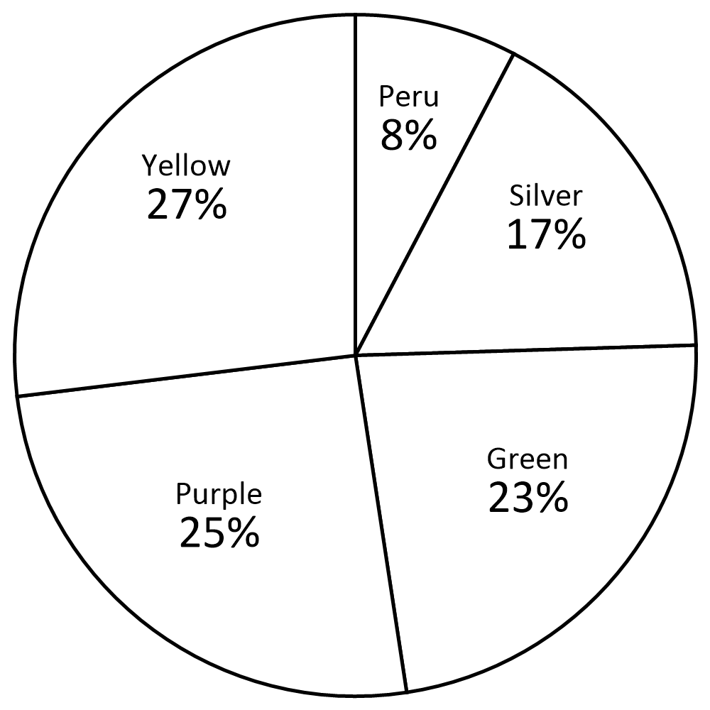
2) Which color is the most?
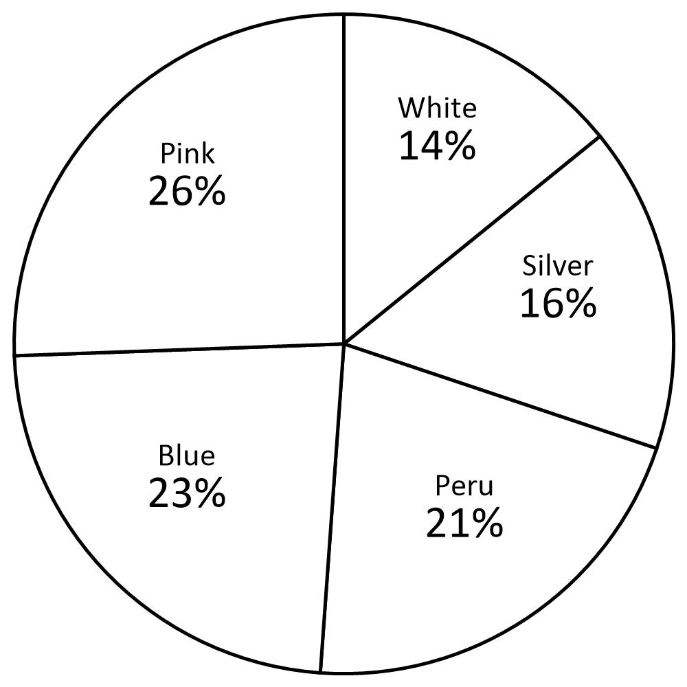
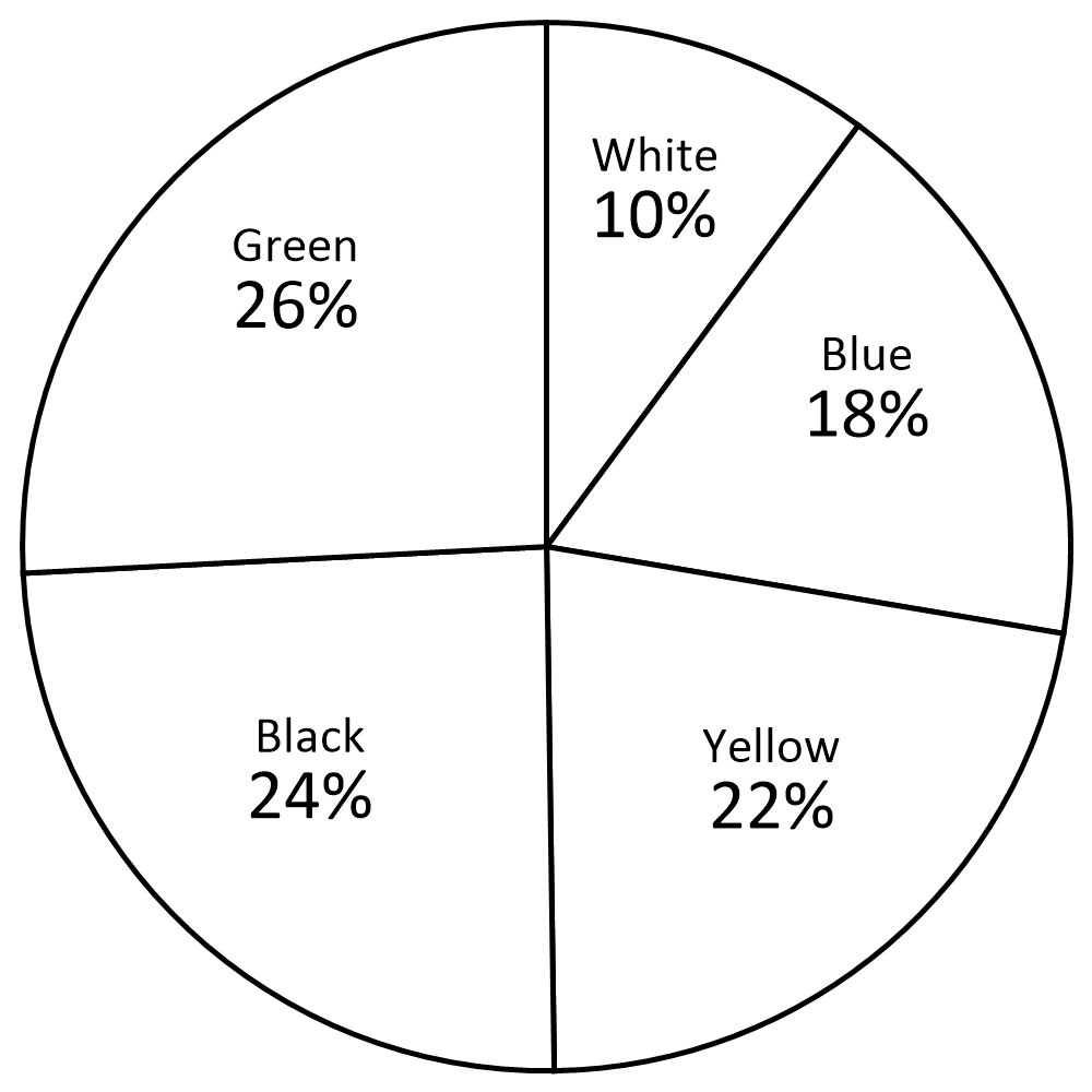
3) What percentage of pie graph is black?
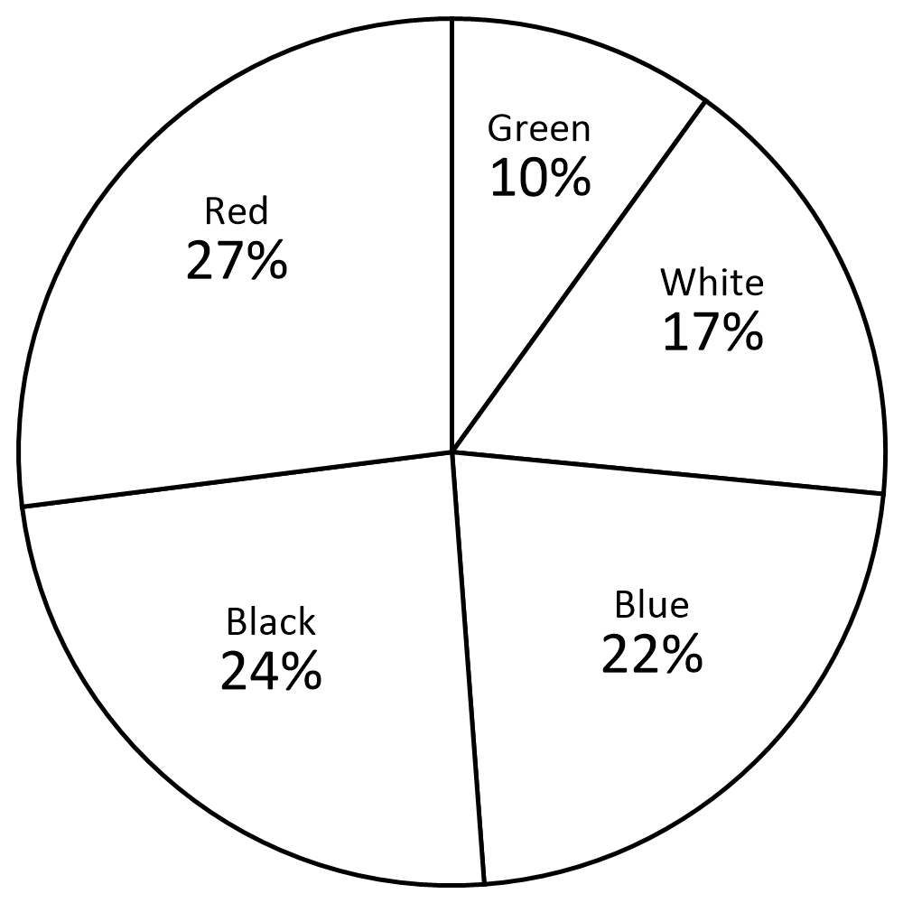
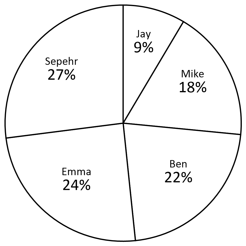
4) What percent of people voted for Sepehr?
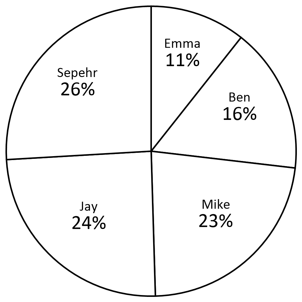
5) What percentage of pie graph is red?
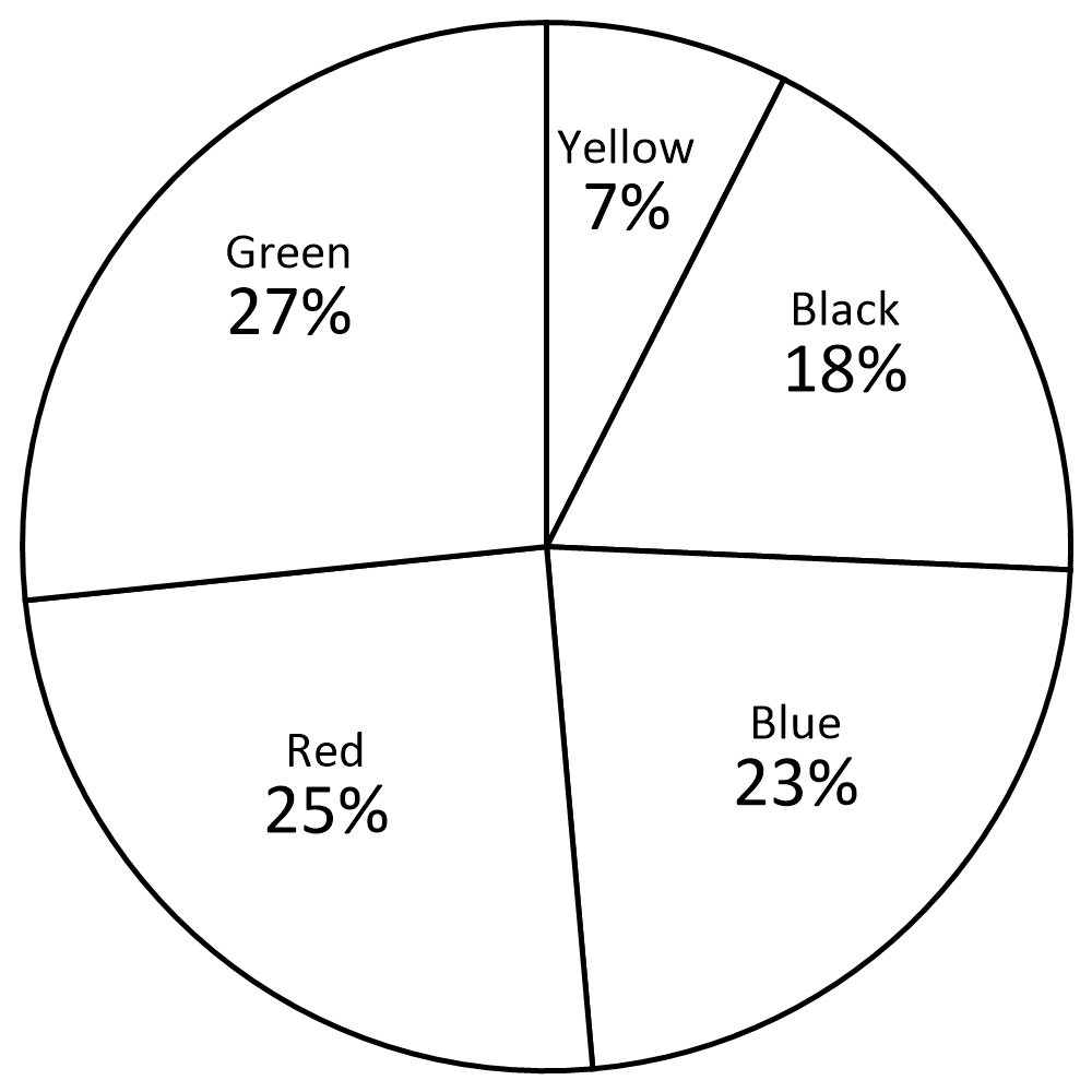
6) What percentage of pie graph is red?
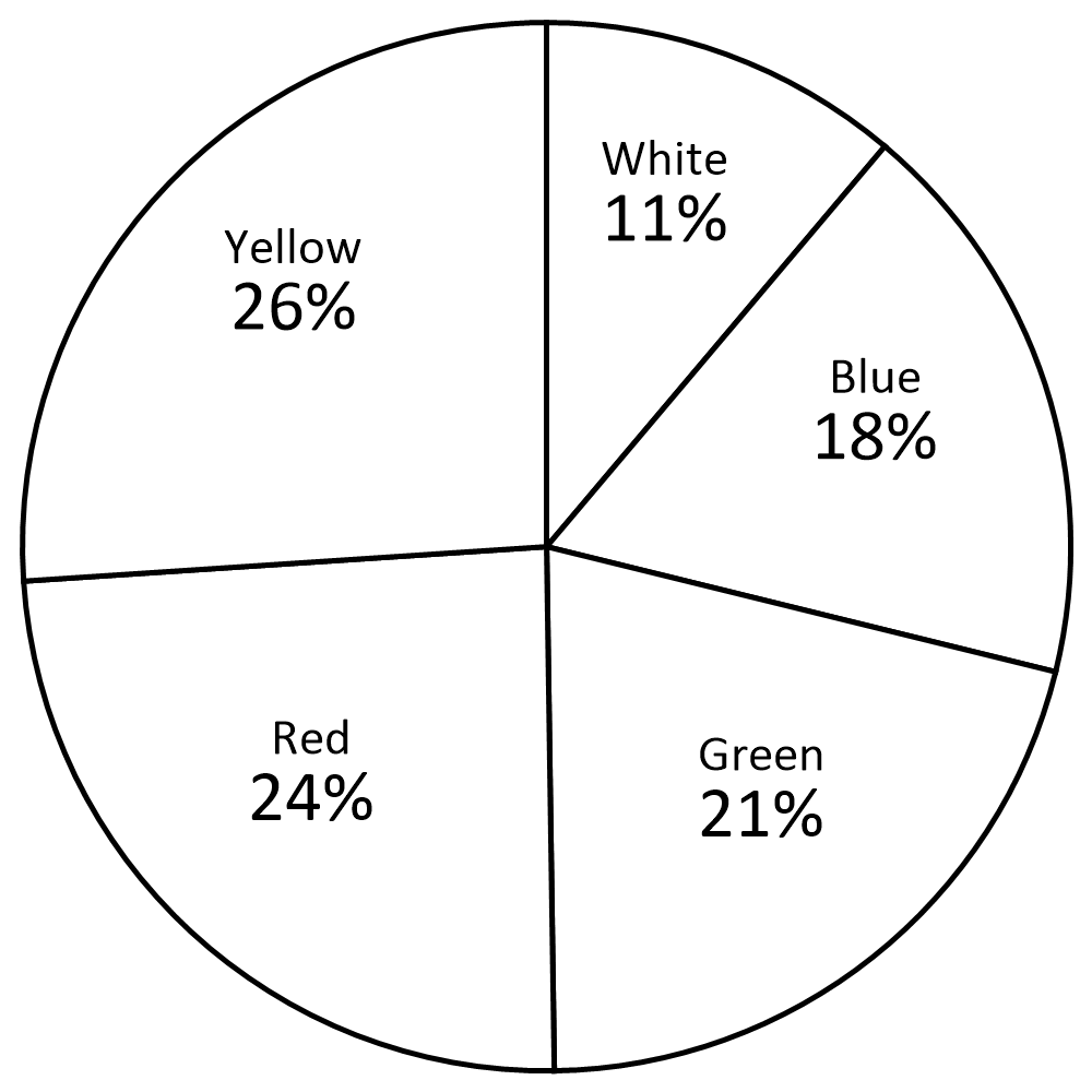
7) Which color is the least?
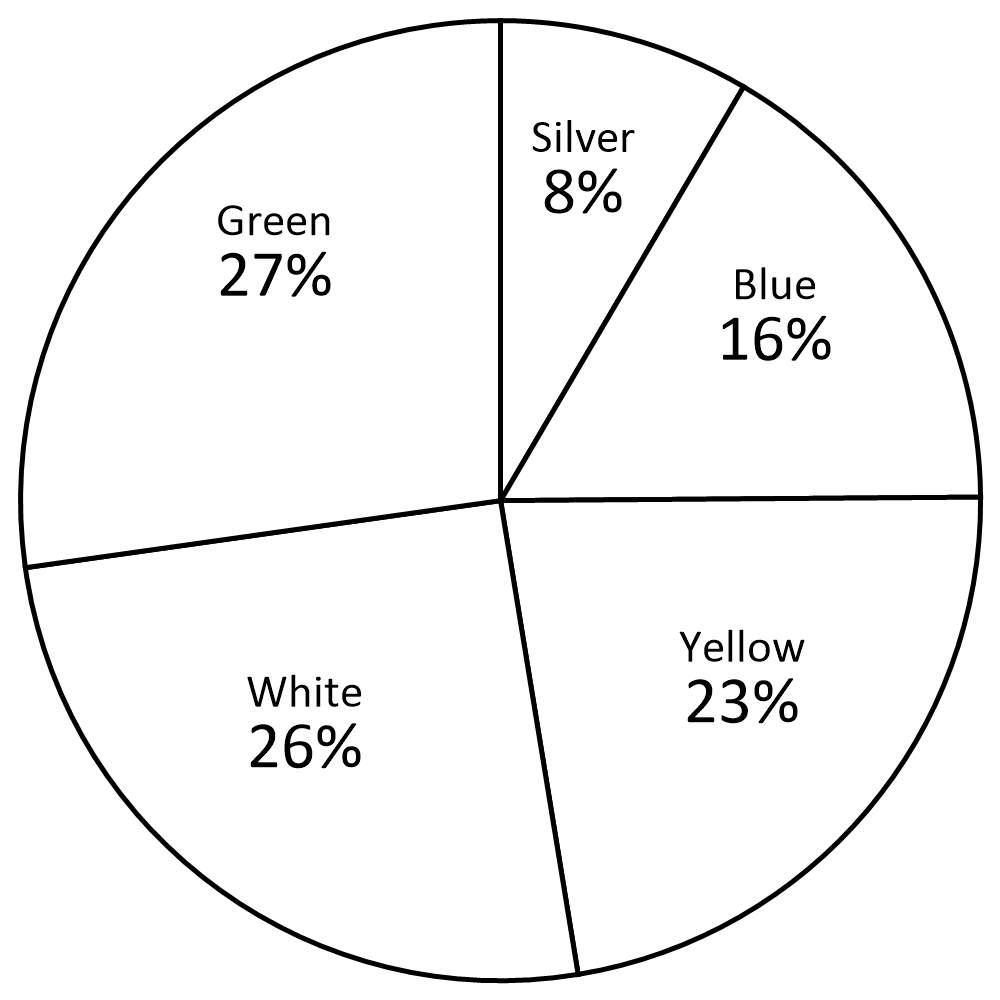
8) Which color is the least?
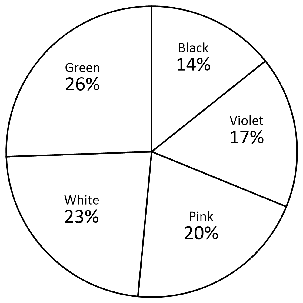
9) What percent of people voted for Emma?
10) What percentage of pie graph is yellow?
1) Which color is the most?
Yellow 
2) Which color is the most?
Pink 
3) What percentage of pie graph is black?\(\color{red}{24 \%} \)

4) What percent of people voted for Sepehr?\(\color{red}{26 \%} \)

5) What percentage of pie graph is red?\(\color{red}{25 \%} \)

6) What percentage of pie graph is red?\(\color{red}{24 \%} \)

7) Which color is the least?
Silver 
8) Which color is the least?
Black 
9) What percent of people voted for Emma?\(\color{red}{24 \%} \)

10) What percentage of pie graph is yellow?
\(\color{red}{22 \%} \) 
The Pie Graph or Circle Graph Quiz